November 12, 2011
A visual guide to the 2011 Dryden results
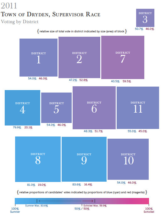
I don't run infographics here very often because I'm not very successfully graphic. However, this amazing one just turned up in my mailbox, thanks to Michael Rider.

Dryden Supervisor's race, results.
If you click the picture, you'll get a PDF that's clearer and has an additional set of bar graphs on page 2.
I especially like this because the sizes of the boxes are determined by the number of voters, not by land area. It's a very quick way to assess the election, and note how blue the bluest boxes are while how purple the reddest boxes are.
Update: Dryden Daily KAZ shares some interpretation.
Posted by simon at November 12, 2011 3:14 PM in politics (local)Note on photos
Awesome! Thanks, Michael!
Thanks for the helpful graphic.
Looks like some more public education / outreach is needed in Districts 1, 2, 7, 5, 6, and 11. . . . Presuming some of the people who voted for fracklovers might still be willing to learn more.
Anyone who owns less than a few acres of land, or rents, stands to gain nothing besides polluted water, air, and food supply -- not even a decent, lucrative, safe, sustainable job -- so there must be room for further education.