May 20, 2005
A tale of two maps
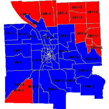
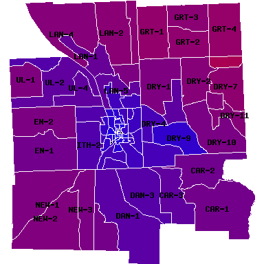
Two books I edited on mapping topics - Mapping Hacks and Web Mapping Illustrated - are coming out next month, so I've been wanting to play with maps. By combining district-by-district election data for the 2004 presidential race, the 2002 Tompkins County election districts map from CUGIR (produced by Tompkins County GIS), Microsoft Excel, some odd XML tricks, and MapServer, I managed to generate both a classic red/blue map and a purple map that shows more variation in how people in different districts voted.

Red (Republican) vs. Blue (Democrat) in Tompkins County, 2004 Presidential Race.
In the red/blue map, you can see which districts voted for Bush (Red) and which voted for Kerry (Blue). The Republicans clearly own the northeast and southwest edges of the county, but not much else.
Switching to a more nuanced map, however, the pattern is somewhat less clear, especially in Dryden, where two districts - 3 in McLean for Bush, 9 in Ellis Hollow for Kerry - stand out from the rest.

Red (Republican) fading into Blue (Democrat) in Tompkins County, 2004 Presidential Race.
You can click on either map to see more detail and more labels. Also, there are some black spots in the City of Ithaca's purple map that seem to be phantom wards in the map. It sounds like election districts have changed slightly since the 2002 map data was published, so it doesn't quite line up with my other data. (When more recent data is available, I'll update the map.) There's no data for those areas, so they end up black, but they should really be blue given their location in Ithaca.
I'll be doing more of these maps in the future, on voter registration and local races. These results aren't at all typical for Dryden, where Democrats turn out far more heavily for national races than for local ones, and I'll be looking more closely to see how these look for elections in off years.
(This map of the 2000 election in New York State from NYCO also inspired this exercise.)
Posted by simon at May 20, 2005 10:58 PM in maps , politics (national)Note on photos