June 15, 2006
Dryden schools: higher taxes and less spending per student?
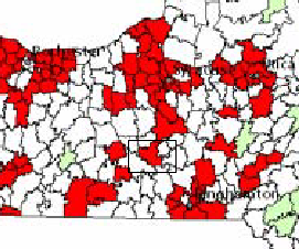
NYCO's Blog highlighted a map showing which school districts face the ugly combination of above average tax rates and lower spending per student. The map comes from the Midstate School Finance Consortium, which is pushing the state for fairer and more transparent school aid rules instead of the strange new package of incredible complexity that arrives every budget year.
The map, available here (299KB PDF) appears to show Dryden as one of the school districts that spends below the state average per pupil but still has a tax rate above the state average.

Dryden school district among the red.
There's another map in the original presentation above this one showing Ithaca in red as well, and I'm not sure why it disappeared, but Dryden appears to be in red in both cases. I'd like to find more detail about how far above the average Dryden is in taxes and below in spending, and which year this data came from, but the map is a good way to highlight how some parts of the state don't seem to be getting quite the help they could use, while others get more.
Posted by simon at June 15, 2006 12:44 PM in maps , politics (state) , schools (Dryden)Note on photos