November 3, 2011
Varna Master Plan presentation
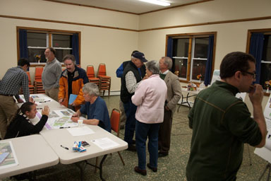
I went to last night's presentation about the Varna Master Plan project to see what they'd come up with. I liked that they didn't actually have a presentation per se, but instead had maps, drawings, posters, and people to talk with. That worked nicely.
What they actually showed was a pretty dramatic proposed increase in density. Obviously, it wouldn't all be built at once, and I suspect large parts of it will never be built, but it did take a deep breath to look at it.
The reason that this master plan "didn't make me want to scream", as I mentioned and someone immediately wrote down as a comment, is that it was actually thought through as neighborhoods with variation, rather than as maximized apartment/townhouse complex density. There are a lot of small - but separate - buildings mixed in with what's still a fair number of townhouses. It doesn't give the sense of walls across the landscape, however, and walkways get as much emphasis as driveways.
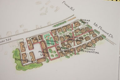
One of my favorite pieces of the proposals was in a place I hadn't seriously considered for additional development, around the yellow house on the southwest corner of the Freese / 366 / Mount Pleasant intersection.
That's a lot of houses packed into a small area, I think effectively adding two or three layers of houses behind the ones fronting Route 366. Look closely, though, and it's very deliberately walkable, with alleys rather than roads or traditional driveways. What's more, much of that pedestrian area is meant to encourage people to walk through from the corner to the railroad-bed trail - and that kind of walking through generally reduces crime.
By looking at Varna as a set of areas - neighborhoods - and how they might be connected, they managed to place a variety of different kinds of housing into a complicated landscape. Forest Home Circle could actually be a good place for a few townhouses. Mixed use at the corner of Freese, Mount Pleasant, and 366 makes good sense.
There's much much more. I've posted a gallery of pictures, which breaks down more or less like:
- Main map
- People
- Area-by-area maps
- Explanatory posters
- Transportation
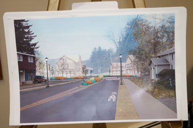
- Rough images of built-out areas
That last piece - the rough images - is probably what scared me the most. If someone showed up with plans for lots of blank cubes, I'd want them to go away immediately. I also found some of the townhouse images incredibly bleak. As a way of showing what these might look like in the landscape, they're very useful, but they're also a reminder that lousy architecture can doom a project completely.
The other piece of this that I worry about is how it fits with existing structures. It didn't feel like they treated the whole area as one giant teardown, but I worry about the structures - many of them actually attractive, or possibly attractive if their landlords didn't think of them as rent machines on their way to teardown - along 366. Again, architecture matters a lot here.
I also still worry about in-between densities. This at least feels like it might avoid the suburban slum effect, of density that is too high to be comfortable but too low to generate things to do and resulting safety - but I'd want to be very careful about how the pieces came together. I think that absolutely has to remain the Town's responsibility, not developers'.
In general, though, this was a lot less painful than I expected.
Posted by simon at November 3, 2011 9:18 PM in Varna , planning and zoningNote on photos


Simon: Many thanks for taking and posting all the pics from the meeting. I sincerely regret that I didn't attend. I didn't know about the meeting and I also missed the one back in June. Obviously I'm not the best informed person around, but I know that I'm also far from the worst. WHCU is my main source of local news and if there was an announcement, I missed it. Which leads me to wonder why we can't have the Town buy a lighted billboard to place roadside in front of the Varna Community Center that could advertise these things a week in advance? This was at least as important as those pancake breakfasts that get much better publicity. Everyone who drives 366 knows when those occur.
I share your concern about the density of Varna II and the look of those cubes in Varna II and Varna Hollow is terrible. Who would the developer be? Lucente? Why does nearly everything that goes up in this area have that cheap "box with siding" look? No more of that!